Many times, businesses get overly focused on the beauty of a new website design. They want it to look sleek and cool.
Nothing wrong with that.
But, you also have to remember it’s more important to create a valuable user experience.
Having a gorgeous design with unique features can certainly be a part of that…as long as they support the user experience. And of course, website design has changed a lot over the years.
So what mistakes might you make today that could frustrate and scare away your users? These:
1. Designing Your Website for a Specific Device
What the market uses changes…a lot, and fast. Smartphones and tablet PCs have become commonplace in every American household. Android and iPhone treat the web differently. For example, iPhone doesn’t support flash.
Plus, prices of desktop monitors have come down so much that far bigger resolutions have become common.
Today, you can’t design for a specific device. Because tomorrow, it could be replaced with something else.
Focus on screen sizes and resolution instead, and you’ll be okay over the long haul.
2. Not Strategizing Your Website Design Before Beginning It
What do you want your visitors to do?
Should they fill out a contact form and become a lead? Is it better for them to subscribe to your newsletter? Would you rather they engage with in-depth content?
First, you need to define a goal for your website. You can even have several goals, as long as you prioritize them.
Work with your designer, or in-house team, to strategize your website design before you begin creating it.
3. Hard-to-Notice Calls to Action
Whether you’re B2B or B2C, your visitors need an obvious call-to-action. Actually, you can’t make your call-to-action obvious enough. The more obvious you make it, the more people take it.
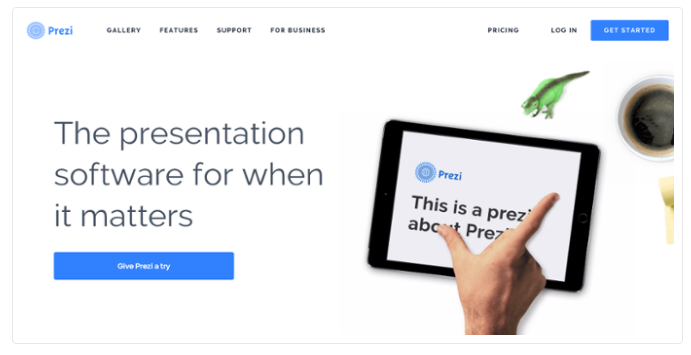
Check out this effective call-to-action from a software company:
Pretty clear what they want you to do, isn’t it? They could make it even more obvious by using a more noticeable color, like orange.
4. Thinking Your Website’s Design is Done When You Launch
In reality, your website design should be constantly tested and optimized for maximum conversions. After launch, you’ll need to collect enough data to make reliable judgments from.
You’ll have to judge what is “enough” traffic to make decisions on. An important part of that is knowing the traffic that does come is qualified and has at least some interest in buying from you. That can require some time in Google Analytics checking out your traffic sources and seeing just how much of it comes from sources where your target market spends time.
When you’re working on your website’s design, it’s imperative to keep these 4 points in mind so you end up with a high-converting website from the start.


Leave A Comment